
Main Feed
This is where the user will see what neighbour seeks or offers some help, be it a babysitter, a supply of eggs and flour, a free parking spot or whatever.
The user can respond with a message or ignore the request.


Main screen
The main screen is cleaner, combining text with large and easy to follow icons for a lighter environment. The new icons provided include security policy, customer club sign-on and chat functions.
Navigation menu
The current menu is categorized, cleaner and easier to follow.
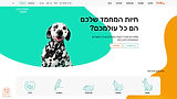
E-commerce Website Redesign
PetBuy


Introduction
PetBuy is an e-commerce website selling pet products and food and providing a delivery service. This website is currently packed and messy, with excessive text and too small pictures and with no clear-cut product or sales hierarchy. Its entire design is old fashioned, uninviting and hard to follow.
Products page
The products page was rearranged on a more spacious grid which secures easier viewing. The product pictures are large and clear, as are the regular and sale prices. Items can be filtered and classified by various categories, then hovered to a wish list or to the cart. A quick view feature was also added.


Purchacing page
In the old website design, the product page came on as an overloaded pop-up. The new design provides a page for each individual product, which allows multiple views, color selection, and add-to-cart or remind-me-to-buy-later functions. At the bottom, several other products are shown which may be of interest to the shopper and fill the cart higher.
Competitors survey
The competitor websites are clean and spacious, with a home page which is not too loaded, offering but a few products and a clearly categorized menu for easy orientation. They also make it very clear to the client that their online shopping is secure and worthwhile.